Before we go on, let’s just assume that this post and every assertion in it have an “in my opinion” attached to them, okay? Cool. Now, where were we…
Dear LinkedIn, we get it. You hired some designers to build you a cool-looking app. But that was then. You’re way behind the times now. The mobile-device-using world has moved on. Your stock is performing well. You have more users than ever. It’s time to release a mobile app that doesn’t suck. Your service already gets a bad rap in some non-sales/business circles. The least you could do is not make your interfaces terrible.
[blog_stripe]What’s so terrible about it?
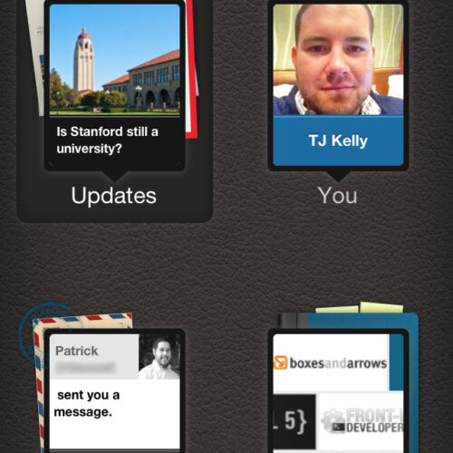
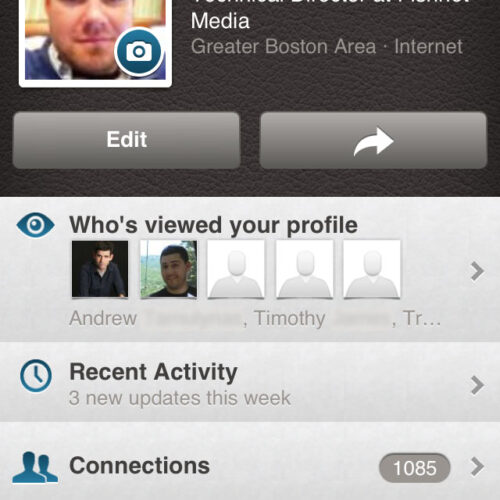
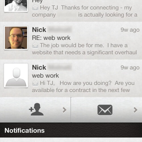
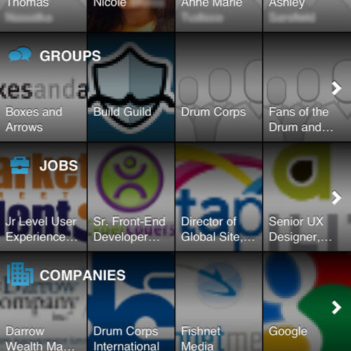
Its aesthetics are based on a faux-leather texture and smooth-metal grays and shadows―two motifs that don’t usually mesh well. On top of that non sequitur, its various sections are represented by tired symbols: post-marked old-timey envelope for messages, address book with protruding sticky notes for groups, and postcards (I think?) for updates.
Aesthetic appeal is not the only important piece of user experience, but it is a piece. It’s one of those intangible things that can help or hurt your users’ experiences using your app. This app looks bad. Its aesthetics stick out. They make me notice how the app looks. And they make me pay more attention to how the app looks than to what the app does. Totally backwards.
[/blog_stripe]It’s more than aesthetics
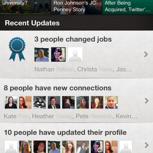
At first glance, my complaints with this app are purely aesthetic. But the more I think about it, the deeper my criticism goes. I’m trying to resist using the phrase “polishing a turd,” but I may not be able to (does that count?). The experience of using the app suffers because of the “LinkedIn Today” headlines atop the main news feed screen―IMO, of course. They’re nothing but a distraction, but LI has clearly demonstrated that they’re the most important thing on the screen.
Isn’t this supposed to be a social network, even if it’s a professional one? And in a social network, shouldn’t the most important things be social connections, not partnered content? Yea, content matters. But it matters because of its social recommendations. I trust my friends to recommend articles. I do not trust the publicly-traded company behind the curtain to do so.
Blah, blah, money and bottom line, blah
Yea, I know. I’ve heard it before. I just don’t buy it. But I get it. Facebook caved and started adding “suggested” stories in their users’ timelines. Twitter caved and stared showing promoted tweets. I get it.
But LinkedIn already does that with “X has posted a job you might be interested in.” For years, LI was built on jobs, recruiting, résumés, and professional networking. Suggesting jobs to likely applicants is a brilliant model. It worked for Monster.com for years. Why overdo it with “hey check out this article some other people like?” No. I’m not here for articles. Especially not while I’m on a mobile device.
For the record, I’m assuming that LI partners with some of these sites for paid inclusion in their “LinkedIn Today” section. That may be wrong. But it seems pretty likely to me.
[blog_stripe]Follow Twitter and Facebook
As critical as I can be of Twitter and Facebook, I think they’ve got the mobile app thing pretty well figured out. LI should follow their model and strip out all the extra junk and go straight for the goods. Put the social back in social media. Lose the overdone textures and “isn’t thing app cool looking” approach and go for ease of use.
I can’t wait until LinkedIn gets serious with their mobile app.
Update: Where are the features?
I defy anyone to show me how to manage recommendations using the mobile app or “touch” mobile web interface. It can’t be done.
Why??
LinkedIn, what the hell? If you pigeonhole users into the mobile “optimized” display, then you HAVE to give them access to all the features and functionality. Right now, you’re assuming that I won’t want to manage recommendations from my iPhone. And you’re assuming wrong.
And to make matters worse, when I tap “Full site” in your touch interface’s footer, you’re not using any sort of cookie or permanent setting. Each time I view a new page or section, you revert back to mobile view—even after I explicitly asked for the full view.
You’re doing it wrong! Figure it the hell out.

Newsflash. Their regular website is crap too.
i dont like it if I check a message on the app, the website still has it as unread, really terrible, and the search capability is atrocious
I agree, this one of the worst Apps I’ve seen. It is so useless that I still use a browser to perform some of the simplest tasks.