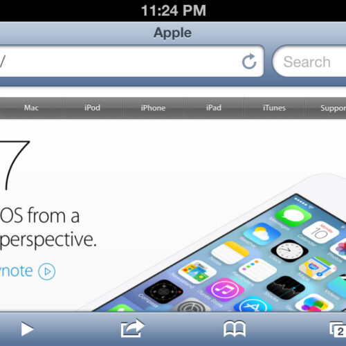
Why isn’t the Apple website responsive? Apple announced iOS 7 today along with some other cool stuff. I wanted to read up on the UI changes so I grabbed my phone and cruised on over to Apple.com. And I was again surprised at how non-responsive it is. Turns out that’s not true, but I’ll get back to that.
In the six years that iPhones have existed and mobile Safari has been in use, Apple has made a point to tout its “just like your computer” rendering of your favorite websites. In fact, that was one of Apple’s main highlights of Safari in iPhone OS’ first few versions. But the web has come a long way since then. And at first glance, Apple.com seems to be holding on to its legacy roots. But let’s take a closer look.
Apple’s Website is Responsive
What do I mean by “responsive?” That turns out to be a very important question in this discussion. Wikipedia has this to say:
Responsive web design is a web design approach aimed at crafting sites to provide an optimal viewing experience—easy reading and navigation with a minimum of resizing, panning, and scrolling—across a wide range of devices (from desktop computer monitors to mobile phones).
When I read that the first time, I thought of BostonGlobe.com and so many other examples which transform themselves from a desktop-looking website to a handheld-looking website without any user effort. But then I read it again, especially this bit: “easy reading and navigation with a minimum of resizing, panning, and scrolling.”
At first glance, I thought that Apple.com required lots of resizing and scrolling, admittedly with no panning. But I started googling, wondering if anyone else had this thought too. This discussion on Quora surprised me and proved I was quick to judge. Quora user Derek Brown astutely pointed out that,
…there are certainly “responsive” aspects to it…the monolithic iPhone 5 is centered on the page when viewed on an iPhone in portrait orientation. Rotate to landscape and the oh-so-clever text is repositioned to the right of the phone…The presentation scales in a similar way on a desktop browser…There are a few things like this that exhibit responsive web design.
Bam, look at that. The Apple website is in fact responsive. It responds to your device’s dimensions and resize events. So why doesn’t it feel like BostonGlobe.com or any other typical example of RWD? Because it’s not (by my biased, relatively narrowly informed opinion) mobile optimized.
- Step 1 (and 5): Load Apple.com in portrait.
- Step 2: Rotate to landscape view.
- Step 3: Landscape layout responds & adjusts.
- Step 4: Rotate back to portrait view.
- Step 5: Portrait view responds & adjusts width.
Responsive vs. Mobile Optimized
For the sake of this post, I’ll define what I mean. I consider a site to be mobile optimized when it rearranges and, in many cases, scales up its content and font sizes to accommodate being read or viewed on a handheld device.
It’s a matter of proportions. On my desktop screen, most of BostonGlobe.com’s eleven nav menu items are about 100 pixels wide. The whole menu is just over 1,200 pixels. Some rough math tells you that the nav items are about 8% of the menu’s width and—on my monitor—about 5% of the screen’s width.
Open the Globe’s website in an iPhone, however, and the menu now takes up 100% of the available screen width. The same menu item just became, proportionately speaking, twenty times wider. That’s what I consider to be mobile optimized. Perhaps I should call it mobile proportionized.
Apple’s website fails the proportion test. Its navigation menu, footer text, and even most page content remain at or close to their desktop proportions. The obvious exception here is the left and right margins used to center the page column on wide viewports. Those disappear on narrow viewports, which expands the proportion dramatically. It does not, in Apple’s case however, jump everything to 100% width as many mobile optimized pages do.
- Boston Globe responsive website, desktop view.
- Boston Globe responsive website, iPhone view.
Why not mobile proportion-optimize?
I don’t know, but I suspect that the Quora-ers got it right. In my best guess, there are two reasons Apple chose not to mobile-proportion its navigation, content, and other elements.
-
Priorities
Apple obviously has bigger fish to fry that to retrofit its website. Namely, awesome new products (even if iOS 7 looks ugly to me). I don’t really buy this reason though. They’re one of the richest corporations on Earth. There’s no reason they can’t hire a few front-enders to optimize their website.
-
Hold-out/demonstration
This is the one I’m going with. They’re holding out, clinging to the “Look, iOS Safari makes websites look like regular websites!” attitude of 2007. They clearly recognize the need to respond to a user’s device and viewport. But they clearly don’t see the need to optimize for it. They’re more content making users pinch and zoom. So much for user experience.







Agree. If you create mobile devices, your site should be mobile-optimized. I don’t get it.