The success of the interstate highway system lies in its consistency. In all 50 states, highway road signs look the same.
Drivers don’t have to guess or interpret. They just use.
UX Lesson: usability really matters. On road signs especially.
[blog_stripe]A good road sign in a bad place
Road signs have to be clear & concise. They also have to be in the right spot.
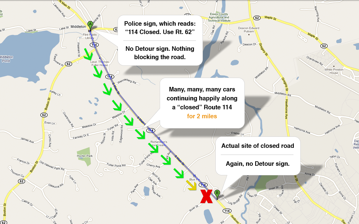
This morning, I had a terrible experience trying to follow ill-placed, unclear road signs about a closed road-the road I take to get to work.
The sign gave good information, but was a whole 2 miles out of context.
It went something like this:
[/blog_stripe]Geographic & Temporal Context
What you tell users matters. But how, where, and when you tell them matters too. Maybe even more that what.
I had to wait 2 miles to figure out that I needed that sign. 2 miles at 30 mph is 4 minutes.
4 minutes of watching the road, watching my speed, listening to the radio, stopping at red lights…
Who could remember that info 2 miles and 4 minutes later?
Or, more importantly, who could predict that a road sign is relevant to your travels 4 minutes into the future?
UX Lesson: Consider the context around your message, not just its contents.
[blog_stripe]Dealing with consequences
After discovering the police barricade, drivers were forced to either turn around & go back where they came from, or turn down side streets without any “detour” signs.
Luckily, there’s an app for that, and I was able to navigate around the problem spot.
[/blog_stripe]
