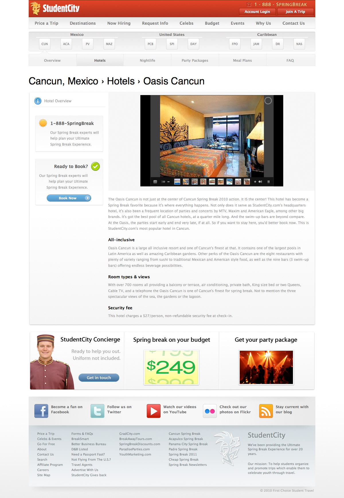
I’ve spent the last 6 months working on a major update and redesign of StudentCity’s Spring Break Destinations section. The new section launched on September 1st and has been, without a doubt, the most successful redesign/launch in StudentCity’s history.
Users first
Our users were always our #1 priority. We constantly asked ourselves, “how does this help the user?” If the answer was anything like “it doesn’t, it’s just nice to have,” then that piece was removed.
In corporate culture (or at least, in our corporate culture), it’s very easy to let “the business” make all the decisions. But “the business” is just that―a business. “The business” is not human and it is not our target user. Our department fought hard to keep the user as our priority and not “the business.”
Visit the new Destinations section
Follow the leader
I’m sure you can tell. We drew some heavy inspiration from Apple and their gorgeous website. I tried to capture some of Apple’s minimalist approach in my design. The challenge, though, was to have a minimalist layout and still convey the fun, exciting parts of the college spring break environment.
For us, the answer to that was simple: photos.
Photos vs. text
We focused on keeping our user engaged on every page, throughout the whole page. Each page has at least 5 photos on it and each content block has only 2-3 short paragraphs. There is enough text content to deliver our message, but the section is largely intended to be a visual tour of our products.
User actions
Websites are nice to look at, but a user has to be able to interact with them. We needed to give the user something to do, not just something to see.
Throughout the section, there are hundreds of “Sign me up” buttons. Each of them loads a lightbox-style ajax form for collecting user data. This means that every content block is equipped with an action. The instant a user feels motivated by our website’s content, they can act on that motivation and contact us easily.
Careful not to over-do it
The user data form submits to our database and becomes a lead for our sales team. But once is enough. So, filling out that form adds a cookie to the user’s browser and once they’ve filled it out, clicking those action buttons no longer displays a lead form. Instead, it shows them a personalized message from the sales rep for their region. Just one more thing to enhance the user experience.
Conclusion
I’m very, very proud of how the new section turned out. It’s the best product I’ve delivered to my company in my years of working there. This is the first project we’ve completed in which the IT department has had free reign over the direction of the project. (We sort of followed the “better to ask for forgiveness than permission” mantra.)
I hope the new section will help the company’s bottom line. If our philosophy is true, then designing a great user experience will lead to more users, more leads, and hopefully more sales.
Screenshots
Destination section index page
Cancun overview page
Hotel page


