I recently read an article on “25 of the Best Websites for Educational Institutions” by Vandelay Design that got me thinking. Sometime last year, I came across a list of the “Best College & University CSS Websites.” The list’s author wrote, “I took some time to go through the USNews.com’s America’s Best Colleges 2007 in search of the best designed sites who are css based. I was very surprised to find so few… only 16 total out of the 124 listed on usnews.com.”
Being a UMass alumnus, I was proud (and still am) that UMass Amherst was one of the 16 colleges that had a usable, accessible, CSS-based website representing its staff and students. The UMass website recently changed again, and seeing the recent changes to the UMass website inspired me to do some research at the Internet Archive’s Wayback Machine. Below, I’ve listed the screenshots and descriptions detailing evolution of the UMass Amherst homepage. Check it out. You may learn something.
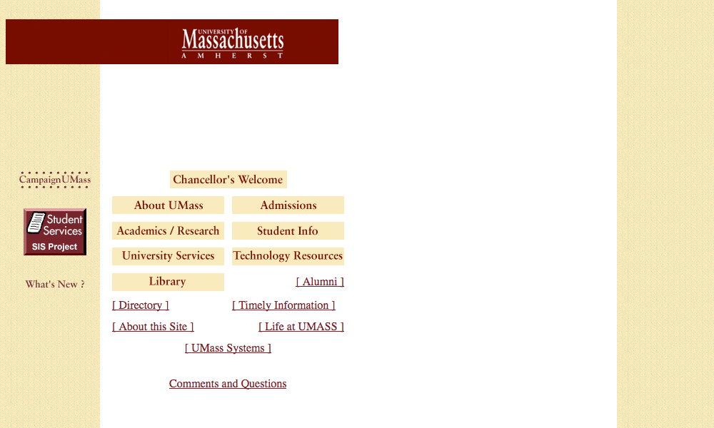
[blog_stripe]UMass Amherst Website: February, 1997
In the beginning, there was text… and not much else. I think this version speaks for itself. Since it was UMass’ first website ever, it gets an A.
[/blog_stripe]
UMass Amherst Website: February, 2000
Here we have UMass’ first attempt at actually designing a website. And, for a “Y2K” site, it’s not half bad.
The site has clear headings, useful links, and even a basic version of graphic branding. All things considered, this site is pretty good for Feb. 2000. Note the differing fonts. Left-side links are in Arial while “Shortcuts” are in Times New Roman. In-line CSS is difficult to maintain, and little things always end up being overlooked.
The site obviously didn’t receive the attention it deserves. But, back in 2000, priorities were different. This version gets a B-.
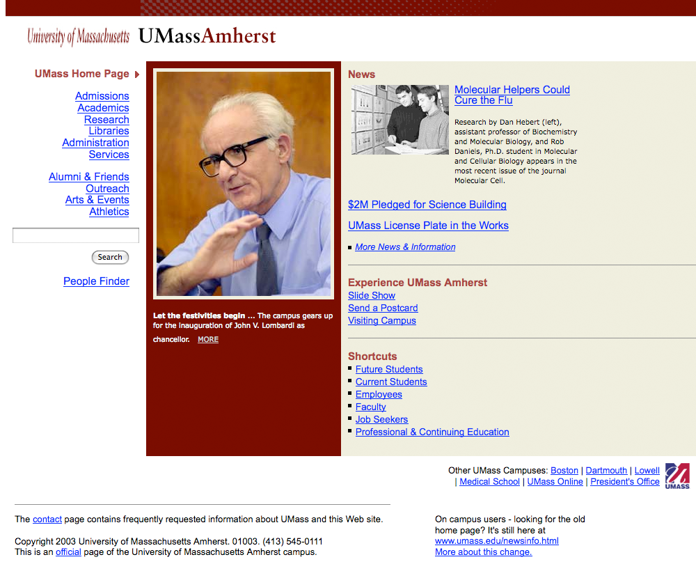
[blog_stripe]UMass Amherst Website: February, 2003
Ah, yes. Early 2000’s web design. How bland and boring. Well, here we have an example of the web’s greatest enemy: websites being designed and built by engineers, not designers. But, you can’t judge the past through today’s lens. We can’t hold it against UMass’ IT team.
Shifting my design perspective back by 6 years doesn’t sound like much. But on the web, 6 years is an eternity (as is self-evident, no?).
This version is very basic. It’s purpose back then was information only. A few pictures, a site search, and text/links. It got the job done, and for its time, it was probably a fairly nice website.
This version gets an even B.
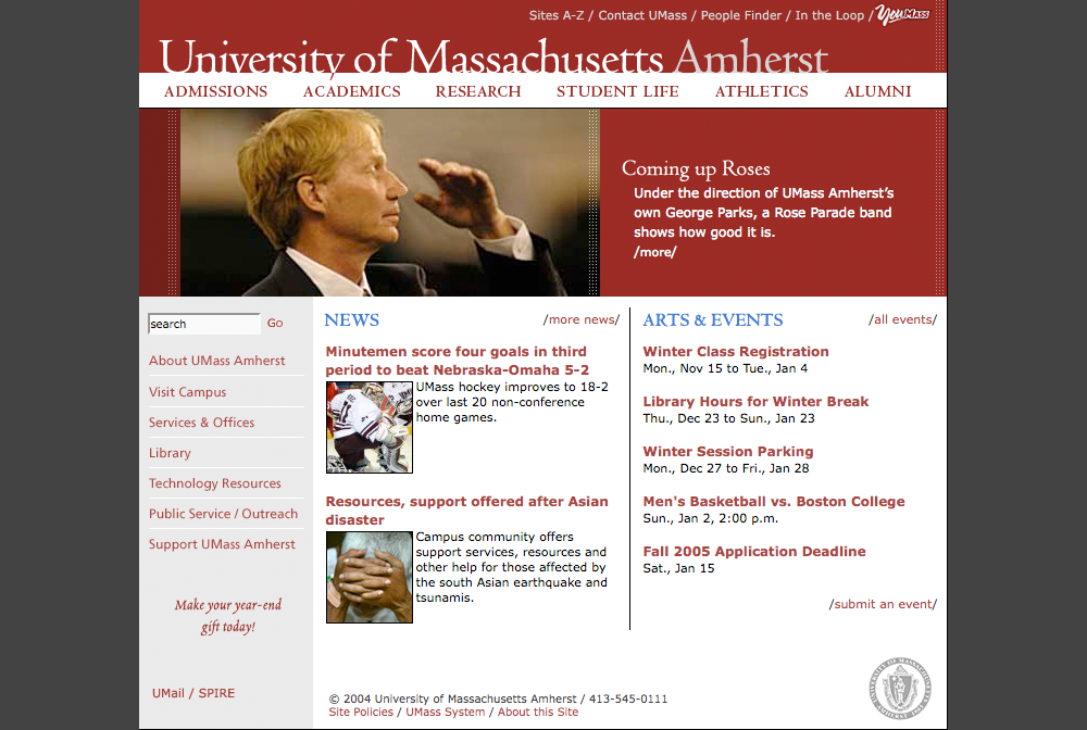
[/blog_stripe]UMass Amherst Website: May, 2004
This version, as far as I could find in my research, was launched in May of 2004. To a web designer, that means one thing: tables. 2004, to many in the web community, is considered the turning point for web design standards. Tables went out and CSS came in. UMass was a little behind the curve, but still relatively current and competitive.
So, since this version was built in tables (as was still largely the standard at the time), it’s hard to compare to today’s version. Apples & oranges and all that. But, by 2004 standards, this version is pretty good.
It again features a large image for capturing the user’s attention (sensing a theme?). It breaks the box with the featured image shifted to the right by about 40 pixels, and uneven columns below. It has a clear, organized navigation system (using images, which is a no-no, but was all but ubiquitous at the time).
All in all, very good. B+.
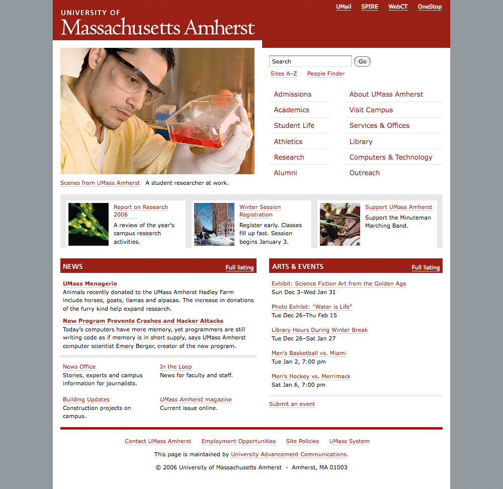
[blog_stripe]UMass Amherst Website: January, 2007
This version works for me. Its initial presentation of the large image is captivating and the brief caption below is informative and leads the user into taking action & investigating that feature. Well done.
The layout “breaks the box” a little bit, which I appreciate, with the uneven heights of the photo area and the navigation list to the right. Added to that are the contrasting 3-column-thumbnails and 2-column-news & events. The navigation list is a very clear, organized system. It’s perfectly simple and easy to use. Nice work.
My only pieces of constructive criticism for this version are that it could make better use of screen real estate, especially in the header, and more variety in colors throughout the site. Overall, very good: A-.
[/blog_stripe]UMass Amherst Website: May, 2009
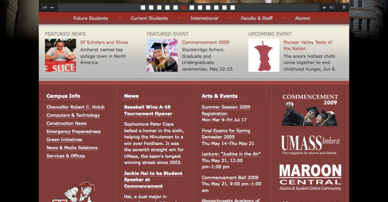
This version includes a rotating image, build on SlideShowPro. My personal preference is to avoid using Flash altogether, but a simple image gallery isn’t so bad.
The layout is a little too box-ey and the design is too dark for me. In my opinion, it doesn’t convey the essence of an educational institution.
The flash slide show is pretty enough and it certainly grabs the user’s attention. But the main features of the homepage are images (strike one) and displayed with flash (strike two), and are therefore completely inaccessible to screen readers and many mobile devices (strike three?).
Overall, I’m not a huge fan. This being a university website, I’ll give it a C+. Bonus points for featuring a photo of President Obama.
[blog_stripe]In Conclusion
Like all websites, UMass’ homepage has come a long, long way in 12 years. And, I don’t think anyone would deny that they continue to demonstrate improvement with each redesign.
Educational institutions, like many large companies, often have the disadvantage of moving very slowly toward any new initiative. Keeping up with the web-Joneses is no different. New technologies and techniques come along, and by the time these giant organizations adopt them, they are often obsolescent.
UMass has almost always done well in the web field, hiring smart people and letting them steer the university’s decisions in the right direction. I’m proud to be an alumnus of the school and their website is no small piece of that.
[/blog_stripe]

I think the 2007 version is a homerun for any university. The latest version is definitely a step back.
Mirza,
I agree 110%. And the way I see it, if the flash content is unnecessary (which I think it is), why include it at all? “Because it looks nice” ? I hope not. Form follows function. Function and practicality are the goals. Unnecessary, inaccessible Flash slideshows are a step backwards.
Thanks for reading.
The flash content is actually unnecessary though. They could have easily done the slider/slideshow in jquery. But then again web design at any big institution is done through a board and that’s where the problem lies.