In August, I reviewed a UMass iPhone app for the University of Massachusetts Amherst, called “UMass Guide” (preview link, will not open iTunes). The app is great. It’s an excellent idea and it will be very helpful to students & UMass community members.
The app was developed in-house as it were, by a current UMass Computer Science student named Daniel Stewart ’12 with editorial assistance from UMass Sports Management major, Stephanie Cheung ’12.
Update: This app and its successor seem no longer to be available. A shame, I liked having that app around.
User Experience Review of UMass iPhone App
One of the reasons Apple is so successful with their products is their attention to detail. When creating an iPhone app, publishers become a part of Apple’s world. And in Apple’s world, design matters. Experience matters. Detail matters.
In that spirit, I’ve considered and critiqued in this review every detail I could find. Every bit of this critique is meant to be positive and constructive. I’m honored to have the opportunity to provide my feedback.
1. App Icon
![]() The university seal is a good choice for the icon. It’s clear and recognizable. The athletic “UM” or “UMass” logos may be better fits, given their “modern” designs. Have you considered maroon-on-white?
The university seal is a good choice for the icon. It’s clear and recognizable. The athletic “UM” or “UMass” logos may be better fits, given their “modern” designs. Have you considered maroon-on-white?
The resolution of the icon is much too small. It was designed for the iPhone 3GS and its 480-by-320 resolution at 163 ppi. The iPhone 4 and its 960-by-640-pixel resolution at 326 ppi resolution are the new standard. 3GS-optimized icons and artwork appear pixelated and distorted on the iPhone 4 since they are, in effect, being stretched to double their intended size.
Compare the clarity of the text and images on the iPhone 4 home screen to the university seal. The difference is striking.
2. Opening the app
This screen acts like a “welcome screen.” Why? What purpose does this screen serve? Perhaps this screen could provide some instructions to the user? Or a brief description of the app’s functionality as well as links in the main content area to the next screens?
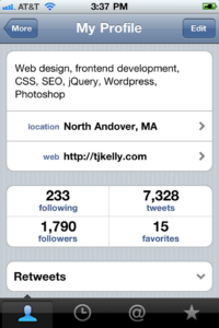
Included below is a screenshot of Twitter for iPhone, a very popular app. This screen is a great example of providing information and “action items.” A screen set up similarly to this one may work well for UMass Guide’s “welcome screen.”
3. Campus Map screen
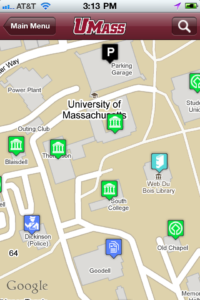 I like the use of maroon in the Navigation bar. Keeping the default colors would be best, but the maroon works fairly well. Great use of the athletic UMass logo. But again, the resolution is too small (magnifying glass icon, too).
The building marker icons have too small a resolution as well. Are they Google standards? I find myself wondering what they mean. Library, Dickinson, and Parking Garage icons are clear. But what’s the difference between the Blaisdell/Thompson/Machmer/South College and Old Chapel/Student Union icons? What does the Goodell icon mean?
4. Campus Map building info balloon
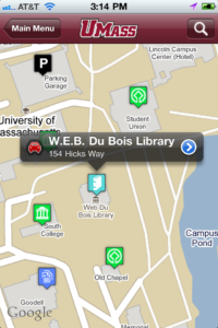 As far as I can tell, these balloons use the iPhone’s default style. Using the default styles is always a good choice.
However, once these balloons appear, I find myself wondering “Ok, now what?” Does tapping this balloon do anything? (Yes, but only if you tap the right places.) Granted, I have the same complaint with the default Maps application too. The user is expected to know that tapping the car icon at left triggers driving directions and tapping the blue arrow icon at right displays more info. Any usability test will show that users tap the center of any item first. In this case, the default user behavior does nothing.
In this case, I think following Apple’s design convention might not be the best choice. My suggestion would be to add a small menu under the “W.E.B. Du Bois Library” title (perhaps similar to the Cut/Copy/Paste menu) which offers two options: “Directions” and “More info.” I have no idea if that’s possible.
5. W.E.B. Du Bois Library (more info)
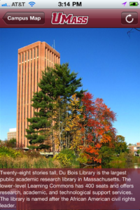 I love the idea of showing a full-screen photo of each building. That could be very helpful for users wandering around campus and wondering which building they’re staring at. However, again I have to point out the poor resolutions of the large photo.
I’m not sure the text description adds any value. It sounds like marketing jargon. Instead of listing accolades and statistics, consider listing building hours of operation, phone number, etc. Remember that the user is accessing this information on-the-go. User behavior patterns for checking information on a cell phone while walking around campus are very different from those of sitting at home, researching a college on the web. What information does a user need right now? Think along the lines of, “Is the library open? I have to print a paper and class starts in 10 minutes!”
 From a design/usability perspective, this screen could be improved. It tells the user, “(1) Look at this pretty picture. (2) Read about this pretty picture. (3) Tap the arrow icon to reload this screen. (4) Tap the ‘Campus Map’ button to go back.” It was a complete surprise to me that tapping the arrow icon does not reload the screen. It loads a new photo. This screen does not inform the user that there are more photos to see. The arrow icon is a poor choice for this task.
Compare that to Flickr’s iPhone app. The app has similar functionality: it displays a large photo; it provides contextual information about that photo; it allows the user to perform several actions around the photo. Navigating to additional photos is clear and simple. Consider adapting the large campus photos in the above screen to match or resemble this screen in Flickr’s app.
6. Google map & directions
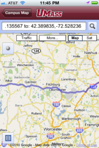 This screen is puzzling. I realize that Google doesn’t give out control of their interface or design, so no real changes can be made here. However, there are a few improvements that could be made.
Why does this app use Google Maps’ web interface, rather than the native Maps app? My best guesses are (a) it’s impossible to launch the Maps app and pass it geo-data and other information all from within your app; or (b) you don’t want the user leaving your app to get their directions.
If (a) is true and you MUST use Google Maps’ web interface, then so be it. This screen is as good as it will get.
If (a) is untrue and it is possible to use the native Maps app, that should be your strategy. The native Maps app is much smoother and easier to use than Google Maps web interface. Yes, it would take a user out of your app and into Maps, but if that’s what the user wants, the app should not prevent it.
Also, worth mentioning: the directions Google provides from Lawrence, MA are just fine. No complaints there.
7. Campus Map search
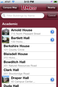 This screen is also puzzling. Immediately, I have a few questions.
Why do some buildings have blue arrow icons and some don’t? After tapping the arrow, I learn that it loads a large photo screen like the library in #5 above.
Why don’t all buildings have photos? Shouldn’t every building have a photo/preview and description? If not a photo, at least a description (and perhaps the info suggested above)?
Why does “715 North Pleasant Street” fit under Arnold House’s title, but “130 Hicks…” gets abbreviated?
Assuming users of this app are only trying to locate these buildings, listing the name and address makes sense. But users will tap the building name, be taken to the map screen with the building name in the bubble, and ultimately get detailed driving directions anyway. Is the address necessary?
Also, is locating buildings the only intended use of this app? Consider replacing the address of the buildings with a brief line about each building’s use: “Arnold House, Nursing Dept. & offices,” “Bartlett Hall, English Dept. & classrooms,” etc. Which of those pieces of information is more useful to a user? (That is, of course, for you to decide.)
Also, worth mentioning: the photo of Arnold House protrudes outside the top-left corner of the list. I’m sure the list could be styled with a property similar to “overflow:hidden;” in CSS.
I find myself wondering about the “Filter Buildings by Name” field. For one thing, only the first word needs to be capitalized. Secondly, does that filter/search bar need to appear there all the time? Consider adding a row of options in place of the filter/search bar that allows users to toggle between “Browse” and “Filter.” This will eliminate the redundancy and put the user in even more control of their method of finding a building.
I have another suggestion for how to handle displaying a long list of buildings. Consider collapsing the list by default and only displaying the categories (“Academic,” “Research & Labs,” “Dining Halls,” etc). In this list of categories, the first option should be “Show all.” Choosing “Show all” would expand a list of every building, listed alphabetically and not broken up by category at all.
Displaying a small list by default and letting the user’s actions initiate the display of a longer list prevents the user from feeling overwhelmed by too “information overload.” It’s a small change that greatly improve the user experience.
8. Filtering the Campus Map search list
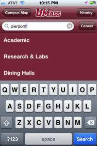 The filtering functionality on this screen has some considerable flaws. I tapped on the Filter filed and began searching for “Pierpont.” As soon as I began typing, list items began disappearing. This is standard practice in many list filter functions, no complaints there. It wasn’t until I had finished typing the word “pierpont” that my confusion arose.
If you’re removing list items as I type, and there’s only one Pierpont Hall, why don’t I see it on this list when I’m done typing? Granted, I hadn’t hit the “Search” button, but the disappearing list items made it seem like I didn’t have to. So now, I’m left wondering, “Where is Pierpont?”
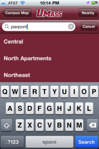 First, I tried scrolling the results screen in an effort to locate Pierpont further down the list. To my surprise, there were no results for Pierpont. It simply wasn’t there. Or so I thought.
I scrolled to what seemed like the bottom of the list and Pierpont was still not visible. The Pierpont list item and the last three categories, “Orchard Hill,” “Southwest,” and “Sylvan” were obscured by the keyboard. I had still not hit the “Search” button as I hadn’t yet realized that it was necessary.
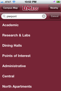 The best user interfaces put the user in complete control. Whatever the user wants the user gets. In this case, I wanted to see the Pierpont list item without hitting the “Search” button. (Worth noting: regardless of whether or not that behavior pattern is what you intend for the user to follow, if the user chooses to follow it, the app should accommodate it.)
After scrolling down the list, I hadn’t located the Pierpont list item yet. I scrolled back to the top of the list and, after a few moments of wondering, I finally tapped the “Search” button. To my surprise, the Pierpont list item was STILL not visible.
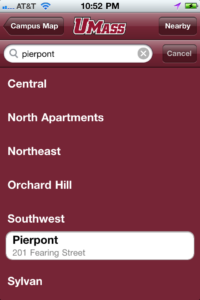 At this point, I began scrolling down the list again, wondering where my result could be. When I reached the bottom of the list, I finally found the building I wanted.
In all this, I wondered why I was still seeing the category titles. As an alumnus, I know Pierpont is a residence hall and will be listed under Southwest and under Academics, Research & Labs, Central, etc. A prospective new student or an inexperienced freshman may not. To that inexperienced user, seeing inapplicable category titles is not helpful.
Consider removing titles of empty categories, the same way you remove list items that don’t match the filter query. This will avoid the filter result list item being stuck behind the keyboard until the user taps “Search” and it will remove unnecessary information from the screen.
9. Useful Links screen
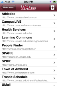 The down arrow/up arrow icon is unnecessary. Will a user need to re-sort this list in descending order instead of ascending? Beyond that, consider categorizing these links by university-sponsored websites and “unofficial” sites.
Similarly to the address beneath the building names, I suggest removing the URL from beneath the website name. Consider replacing it with a brief line describing the site, e.g. “Athletics, NCAA athletics & sports,” “Health Services, On-campus hospital,” “Learning Commons, Library resource center,” etc.
10. Info screen
 This screen is entirely unnecessary. This information is excellent and useful, but it doesn’t belong on its own screen. Consider adding this to the “UMass Amherst” welcome screen or a similar screen with more uses.
As with the building photo screens, the arrow icon does not signify “next photo.” It says, “reload this screen.” Also, when a user taps the arrow icon and loads a new photo, consider loading a new paragraph with more general UMass information.
11. Settings screen
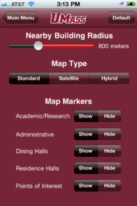 This screen is laid out well, but I wonder about the color choices. I stated earlier how adhering to Apple’s original iPhone design (and colors) is best. That idea bears repeating with this screen.
I’m not sure this functionality is necessary, but it’s always a good idea to let the user control their experience as much as possible. I like the idea of customizable settings and I give you lots of credit for including them.
12. Conclusion
This is a good app. It’s useful, informative, and it gives the user some control. But, of course, there is room for improvement.
Step one of creating any public-facing product (like an iPhone app, a website, or a brochure) is to ask “Why are we creating this? What is our goal?” Once that goal is identified, we the creators must set out to achieve that goal as simply and effectively as possible.
It’s easy to let outside factors play a role in the product’s creation, but we must fight that temptation or pressure. The user and the user’s benefit must be the only criteria we consider when making a decision. At every turn, we must ask ourselves, “How does this help the user? Are we adding this for the user’s benefit or for ours?”
Keeping the product simple is always a challenge. “Features” begin to creep into the mix. “Features” are usually unnecessary and end up diluting the product’s original purpose.
That user-focused, simple approach relates to your app in the overall organization and functionality. Is the “Useful Links” screen necessary? Is the “Info” screen necessary? Or are they “nice to have?” Adding “nice to have” features is actually not so nice. Consider stripping the app down its bare necessities and removing the “nice to have” features. Let the app be simple, effective, useful, and beautiful, just like the iPhone it runs on.
This app is a great idea. It’s a big step in the right direction for a world-renowned university and I am thrilled that my alma mater is adopting modern technology so well. Much of what we know and love about the internet and the web were born at colleges and universities (ARPANET and the early internet at UCLA; Google at Stanford; Facebook at Harvard). I hope UMass Amherst can become a pioneer in the practice of using handheld devices to enhance students’ college experience and education and that this app is a part of it.

