HTML email sucks for two reasons: support (or the lack thereof) and necessity (or the lack thereof). Everyone knows it sucks. Ok, not quite everyone. On second thought, hardly anyone knows that HTML email sucks. Marketers, businesses, tunnel-visioned sales personnel, they all seem to think HTML email is great. It’s not great. It’s the opposite of great. It’s horrible.
Lack of Support
Web browsers have come a long way over the years, but email clients’ HTML-rendering skills have not. And I’m ok with that. If I may blatantly steal from the great Jeffrey Zeldman here,
Companies spend hours crafting layouts that may not work in Eudora or Gmail, or may no longer work in Outlook…Even in programs that support the crap code used to create these layouts, all that hard visual work will go unseen if the user has unchecked “View HTML Mail” in their preferences…As for CSS, it is partially supported in some e-mail applications and in web apps like Gmail, but only if you author in nonsemantic table layouts and bandwidth-wasting inline CSS. (Zeldman, 2007)
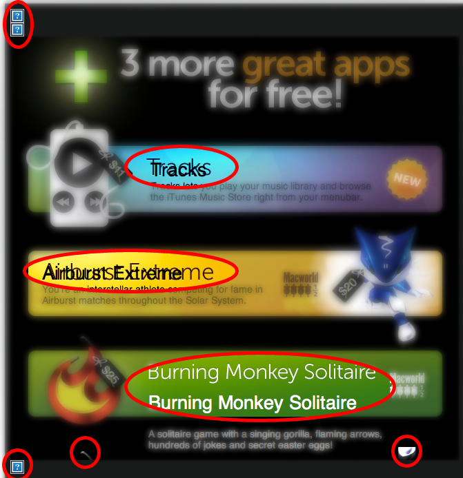
I recently got an HTML email from MacHeist and it exemplifies perfectly why support for HTML emails is a major problem:

In the screenshot above, there are eight display errors in a section about 700×700 pixels. That’s a huge ratio, especially considering the time and effort that obviously went into creating it. The email was rendered by Gmail on a MacBook Pro.
Lack of Necessity
The second, more significant problem with HTML email is that it’s completely unnecessary. Email was not intended for “designed content.” It is a medium for messages. Granted, the web is too, but the web is a rich platform offering and delivering much more. Email is not. Email is for discussion.
Imagine if text messages could be designed. (I’m sure it’s coming soon.) Your mom would send you texts in giant, pink letters saying “HPPY BRTHDY 2 U!” and you’d hate it. Because that’s “not what texting is for.” That’s not what email is for either. What’s the difference? Someone tried it in email. And we didn’t kill them. An oversight on our part, for sure.
Worth pointing out: Zeldman wrote his brilliant post about HTML email just shy of 3 years ago. And it’s even more true today.
HTML email sucks.

I will 150% agree with you. We have a client who sends out about 40 HTML emails per month (different websites and different mailing lists) and we have to “design” them all. They waste a ton of money to pay us to create them and the email never turns out the way the client wants them to. We try to explain this to them, but they don’t really want to listen. There are days I have to stay late at work just to make the client happy with how the email gets sent out.
“Move that image up and to the left a little”, “Can you make it so the text doesn’t wrap under the bullet?”, and my personal favorite, “Can you make that background image more transparent?”. The funny part about the background image one is that I have Office 2007 which doesn’t support background images so I have to waste my boss’s time just so he can check the email in 2003.
Why do people think that full scale HTML emails are the best way to display information? It makes my head hurt sometimes.
Well yeah, Gmail is one of the worst email renderers out there; it’s worse than Outlook. But I agree with the idea. HTML emails should be either reallllly simple, or given to Marc Amos to code as he is just so darn good at them. :)
(Also, what is the third field for in your comments? I feel like I guessed on Name and Email, hopefully those were right.)
Tim, I feel your pain man, definitely.
Fred, Marc is clearly the best. And yes, 3rd field is website. JS error caused my labels to disappear. They’re back now.
Fred, I will stab you.
I’m going to have to take a slightly different tact, here. It’s the support for HTML email in email clients that sucks. The use of visual style in emails is not inherently evil. In fact, I think one could make a pretty strong argument for visual style via HTML (ideally, via CSS) as a usability bonus… if the email clients of the world would just let WebKit do the rendering.
At UIE, we sent out plain text emails for a long, long time. We’ve just started using *very* simple HTML emails. First thing to note is the vast majority of people don’t even know what RSS is, let alone use it. Average web folk sign up for email newsletters when they want to know what’s new with a company. We had people asking for HTML email so that it would be easier to read with headers and such.
With HTML email, you can also measure response. We have *a lot* of people who’ve signed up for our list, http://www.uie.com/uietips/ and we really need to know if what we’re sending them, mostly research articles, is effective. Otherwise, we’re just clogging their inbox.
Now, that’s not to say that HTML is not abused by many, many senders. But, that’s a different argument. If the world would get on the standards wagon, we could move forward here.
Brian – Thanks for the comment. I agree that measurement is a great advantage of html email. And UIE’s version of it is an example to be followed. Simple layout enhancements that make reading easier. The above example is just one of many that WAY over-do it.