I clicked a link to a Business Insider post yesterday…I’m not sure why. Please forgive me. But when I got there, something struck me about its layout. At first glance, I thought I had missed something. The page didn’t look right. But I looked harder and, sure enough, their layout was displaying as they intended. Take a look:
That tiny column of text is the article I came to read. That tiny, dwarfed-by-other-stuff column of text is the reason I’m here. That tiny, why-the-hell-is-it-so-small column of text is the thing your editorial team (presumably) worked so hard on. That tiny column of text is the point. And yet, it’s so…tiny.
I did the math.
When you compare all the pixels on the page and crunch some numbers, you get a surprising result. The content makes up just over 16% of the initial viewable content area. For comparison, my website’s content makes up 77.5% of the viewable content area. I’m no gold standard, but 16% seems low no matter what you compare it to. Here’s how the breakdown looks:
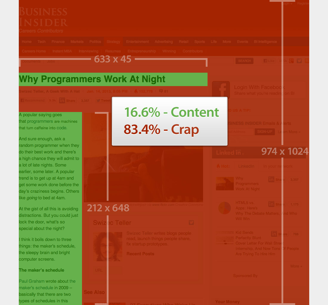
You could argue that the photo is included in the content, and you’d have a point, but I would disagree with you. I didn’t visit this page to see that photo. I came to read the words. The photo makes a nice addition, but it’s just filler. I can’t tell you if the photo is referenced in any way in the article content…because I never read the article. I was so stunned by the bad experience that I never bothered to read any of it.
Why is this ok?
I can’t be sure, but I have a hunch that Business Insider works hard to stay in the black with their web publishing budget. Their layout is crammed full of promos, social media, “related” content, blah blah blah. Oh, and the page has a 10-second banner ad that effectively shows a commercial before sending along the content. Their editorial and technology costs probably force them to scratch for every ad dollar they can raise. So, most likely, they sacrifice things like user experience to squeeze in more promos or other junk. At a certain point, doesn’t that approach Catch-22 territory?
Ad placement goes up › user experience goes down › page views go down › ad revenue goes down › ad placement goes up…around and around we go.
Now, I know there’s no direct correlation between user experience and page views, but there is most definitely an indirect one. Seeing bad experiences like this one makes me wonder about the business (insider) model that goes along with being 84% crap.
I see this all the time. Thanks for pointing it out!
My pleasure, Mike. Thanks for the comment.
Nice article. There’s definitely a hidden cost to ad-placement that would wipe out your ad revenue. If you had access to a large database of % Content/% Crap vs. site visitor stats, it’d be really interesting to see where the break-even point is.
Thanks, V. I think if you found that break-even point, you could patent it and retire!