Design
I love learning about and discussing web design, best practices, common trends and conventions, and the elements that comprise a great website. Most of the time this comes from finding an excellent site and wondering “why didn’t I think of that?”
-
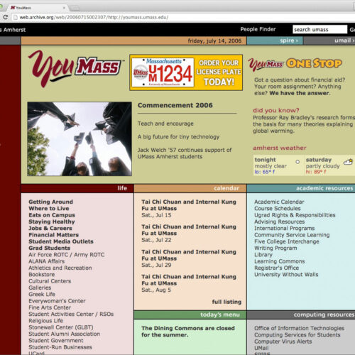
Inspiration: YouMass Microsite – 28 Blogs Later, Day 7
YouMass student resource microsite: an old piece of inspiration. When I was in college, UMass Amherst's "YouMass" page inspired my earliest web designs.
-
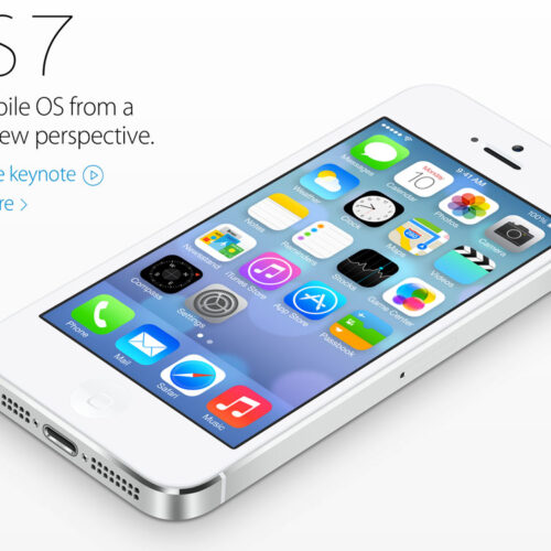
iOS 7 Sucks – The Emperor’s New UI
iOS 7 sucks right now. I know it's still in beta & it will improve before public launch but this is Apple we're talking about. They're better than this.
-

Windows XP Desktop Backgrounds
I compiled a list of the default Windows XP desktop background wallpapers. XP was everywhere when I was getting my start. Windows XP & its desktop backgrounds helped shape the designer I am today.
-
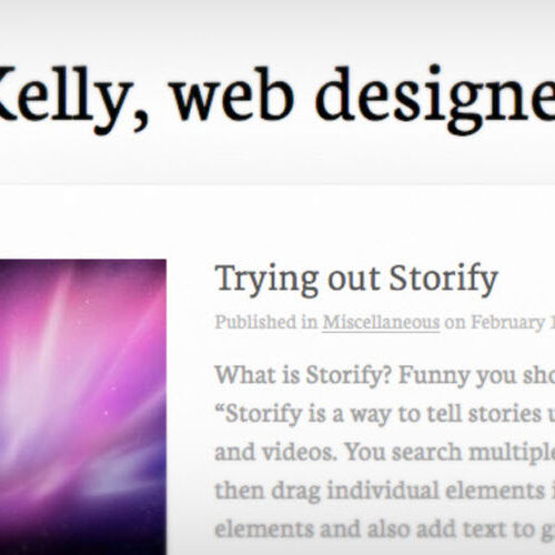
Another Year, Another Redesign
I redesigned my site again. I upgraded to HTML5, added Web Fonts, and coded with OOCSS. This is the 3rd major revision and it's been almost 18 months since I did any design work on my site. It's time to go back to basics―less is more.
-
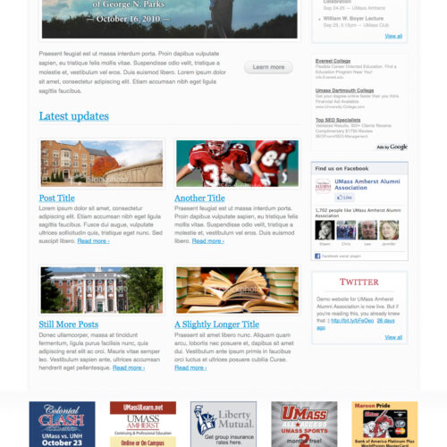
Design Demo: UMass Alumni
This is a demo website I designed for the UMass Amherst Alumni Association. The site is completely hand-coded (no CMS) and is full of lorem ipsum.
-
Web Design “Strategy”
Design by itself is meaningless. It's content that matters. People don't visit your website because it looks nice. They visit because you have something they want. Your job is to give it to them. Content precedes design. Design in the absence of content is not design, it's decoration.
-
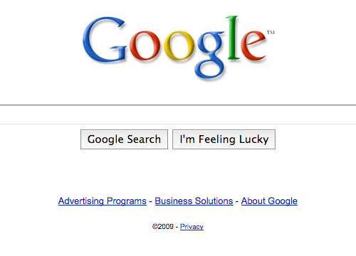
Google's Interface Changes
I'm not really a fan of Google's latest design changes. Increasing the size of the text-input seems fine, but the new buttons are atrocious. The biggest difference is the font-size on the buttons. But, with Firefox 3.5 on Mac OS X, the default crystal-themed buttons can only get so big.
-

On WordPress as a CMS
Using WordPress as a CMS? Here are some pros and cons. My two cents? WordPress is an excellent CMS and I highly recommend it.
-

On “Harsh Truths” and Excellent Advice
Sometimes other people can put your thoughts into words better than you can. Jeffrey Zeldman and Smashing Magazine have absolutely nailed this one. Smashing’s latest article, 10 Harsh Truths About Corporate Websites is spot-on and near-flawless. Read it. Learn from it. Heed its advice. Now if we could just get the corporate world to listen […]
-
On Designing with a Purpose
All websites have a purpose, even it’s just to appease the ego of the author. Most websites’ purpose is either to sell something, or to provide some relevant information. In both cases, authors and designers need to take a practical approach to their creations, ensuring that their work assists the website accomplish its task and […]
-

On Bad Designers (aka Managers)
Sales people, operations staff, project managers, supervisors, and CEO’s could all stand to learn one simple lesson: YOU ARE NOT A DESIGNER! I’m pretty sure they didn’t offer information architecture classes or graphic art seminars in your MBA program. And I’m 100% certain they didn’t analyze web usability case studies in your undergrad School of […]
-

On Creativity
I’ve always considered myself a creative person. I used to draw a lot when I was a kid. I’ve written stories, songs, and poems. I’ve even tried my hand at screenwriting. But for as long as I can remember, I’ve had difficulty connecting each step of the creative process and I’ve never really been able […]
-

On the Latest Redesign
It seems a redesign comes once a year or so. The last few redesigns applied to this site were products of necessity. I was trying to get a new job.. I wanted to ditch tables, etc. But this one, coming about 13 months after its predecessor, is based on nothing but boredom. I was tired […]
-
On Web 2.0-ness
Well, it’s springtime again. And you know what that means… a new design for this site. This one was inspired by a few big factors. One, it’s time to evolve beyond the tiny 800×600-compatible layout. Another key influence was the "web 2.0" craze out there. Let me explain that… As a designer, I do believe […]
-

On Back-End Beauty
In a “web 2.0” age, anyone who knows what to look for in a well-functioning website will give a subject site the ol’ once-over, and just as quickly, hit a few familiar keystrokes and peruse the site’s source code. Of course, with Ajax-based web apps gaining in popularity, “source scoping” is becoming a futile effort. […]

